The Tarte for True Blood palette, the Tokidoki Devil Girl palette and the free birthday gift :)

The card in the back of the palette inside the packaging is a booklet.
The Front

The inside has look ideas:

and the back has all the information:

This is the outside. I thought it would be drawn on, but it's actual eyelets with elasticy bands in between. It's pretty, actually!

When you open the drawer that says 'Open After Dark', there is an eyeliner, an eye primer and a mascara inside.

The eyeshadows:


With the plastic insert on top of them, you can see their names:

Now swatches. I took these in different lights without flash so that you can get a good idea of what they look like. I also swatched with a brush and without any primer. So this is on my bare arm! I'm NC40 for reference.
Lightbox
from L-R: The Light, Fairy, Dusk, Dawn


As you can see, The Light and Fairy are very very pale colors. You can barely see them on my skin. I think a good primer and they will be good to go on the eyes. They'd make nice highlight colors imo.
Dusk is a very light caramel brown color. Dawn is a pale gold color. It's very shimmery although it didn't translate well in my pictures.
Lightbox
from L-R: Werewolf, Waitress, Nocturnal, Charmer


Of these, Nocturnal is misspelled on my plastic insert, it's spelled 'Noctural'. LOL But it's probably the most unique color in the palette. It's packed with blue glitter and gorgeous.
Werewolf is a matte brown, Waitress is a very glittery, very golden light brown. It turned just plain gold on my skin. The texture on this reminds me of a soft MAC lustre. Not as chunky as say Honeylust or the old Kitschmas formula. I'm sure it'll look pretty foiled, but not too fond of it. Charmer is a pretty pinky peachy copper color. Very pretty and very shimmery as well.
Lightbox
from L-R: Glamour Me, Stake, Bayou, Telepath, The True Death


Of these, Stake is probably my favorite. It's a very pretty matte grey. Telepath sort of reminds me of UD Grifter. I got rid of it a few years ago so I can't compare, but from what I remember of Grifter, this makes me think of it. Very glittery, too. Bayou is a gorgeous gold color. Very smooth and the True Death is one of the most pigmented pressed silver eyeshadows I've ever swatched. Seriously. I couldn't believe how silver it looked on my skin when I first swatched it. It reminds me of the Kryolan Aquacolor Silver. The only difference being that this is dry and the Aquacolor had to be wet to be applied.
Lightbox
from L-R:The True Death, Immortal, Moss, Legend, "V"


Moss and "V" are the standouts in this group. Moss has to be my favorite color in this palette. I am a huge green fan, so I am biased. But this green is just so beautiful, I'd buy the palette again just for this. Immortal is just a black with silver glitter and Legend is a matte charcoaley black. Nothing too special.
Overall, despite the different finishes and textures in this palette, they all have a couple of things in common.
1.) They're highly pigmented.
2.) They're very powdery. I guess they're finely milled?
I can't really describe what I mean, but I can show you what I mean.

Lots of powder 'fall out' I guess you could call it. It accumulates around the brush and in the pan. I can imagine fall out would be a definite when applying these eyeshadows as there was tons of it while I was swatching. But overall, I like the palette. I'm happy with the color range. There are some colors I can't see myself using, but for the most part, this will be something I can use and enjoy.
Now, the Tokidoki Palette. I haven't swatched it yet. I just think it's the cutest thing!


Now, how about some swatches of MAC's Hocus Pocus? Jealousy Wakes? I guess so, since I'm being lazy and all! :p
Hocus Pocus

Hocus Pocus surrounded by Smoke & Diamonds, Copperplate, Surf USA and Groundcover.
 From L-R: Groundcover, Copperplate, Hocus Pocus, Smoke & Diamonds and R&R Nailed over Fyrinnae's Pixie Epoxy.

 From L-R: Groundcover, Copperplate, Hocus Pocus, Smoke & Diamonds and R&R Nailed over Fyrinnae's Pixie Epoxy.

Jealousy Wakes
(Haha, my LJ name! Now you know me everywhere :p)


This looks more blue in the pot than expected. This is the most color accurate photo.
It even swatches more blue than green. But on the eyes, it's more green :D
(Haha, my LJ name! Now you know me everywhere :p)


This looks more blue in the pot than expected. This is the most color accurate photo.

It even swatches more blue than green. But on the eyes, it's more green :D

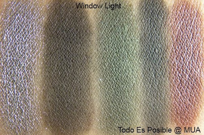
And last for the day, Make Up Store, anyone? I have none near me, but they do have free shipping on orders over $50! I phone ordered from the store in Colorado. It was awesome! The customer service was awesome and they shipped one day after I ordered! Can't really ask for anything else imo.
From L-R: Alma, Britta, Greta, Madeleine, Siw and the Aqua Fix base

Well, that is it from me for today! Thanks for stopping by, I hope you enjoyed the pics and swatches and have a great evening!
No comments:
Post a Comment